revolut
A 24-hour challenge to make money insights simple, visual, and personal.

Revolut - Transform financial data into a more engaging, visual, and reflective experience.
Project overview
Duration
24-Hour Industry Hackathon
Team
2 UX Designers, 1 Data Scientist, 1 Software Engineer
focus
Transform financial data into a more engaging, visual, and reflective experience.
Role
UX Designer
The Problem
Young users often avoid tracking spending due to overwhelming data formats and lack of contextual feedback. How might we present this information in a way that's engaging, easy to interpret, and encourages financial reflection?
Design Challenge
Revolut challenged us to enhance user engagement by making financial data more relatable and visually engaging. Within 24 hours, we conceptualised, designed, and pitched "Revolut Recap". A mobile-first feature that turns financial behaviour into digestible insights through clean, intuitive visuals.
Primary research
We conducted primary research to better understand user behaviours and needs. While most participants used tracking tools, many felt overwhelmed by charts and unsure of what their data actually meant. The common thread was clear, users wanted clarity, context and encouragement, not just numbers.
Participants
12 users.
Age Range
20–35 years old.
Methodology
Conducted 1:1 interviews via phone and Google Forms to explore user motivations, behaviours and key pain points.


Secondary Research
To build a foundation for our design decisions, we explored fintech trends through web searches and competitor benchmarking. This helped us identify a common gap in most financial apps focus on tracking, but offer little personalisation, clarity and meaningful guidance.
[ 01 ]
Monthly summaries & spending breakdowns
Category-level budgets
Behavioural nudges
Reflection moments
[ 02 ]

Spending trends & basic alerts
Some budgeting tools
Generic insights, not tailored
Corporate tone, not user-first
[ 03 ]
Clear currency exchange & transfer tracking
Transparent fee
No budgeting or spend reflection tools
No education, goals, or investment guidance
From Insight to Idea: Ideation
With the user voice in mind, we mapped out their emotional journey from transaction to reflection. In a fast-paced ideation sprint, we sketched multiple concepts focusing on personalised summaries, visual storytelling and gentle nudges. The goal wasn’t just to track spending, but to help users make sense of it, feel in control and stay motivated.
We prioritised simplicity, positive reinforcement and brand alignment to bring the Revolut Recap feature to life.
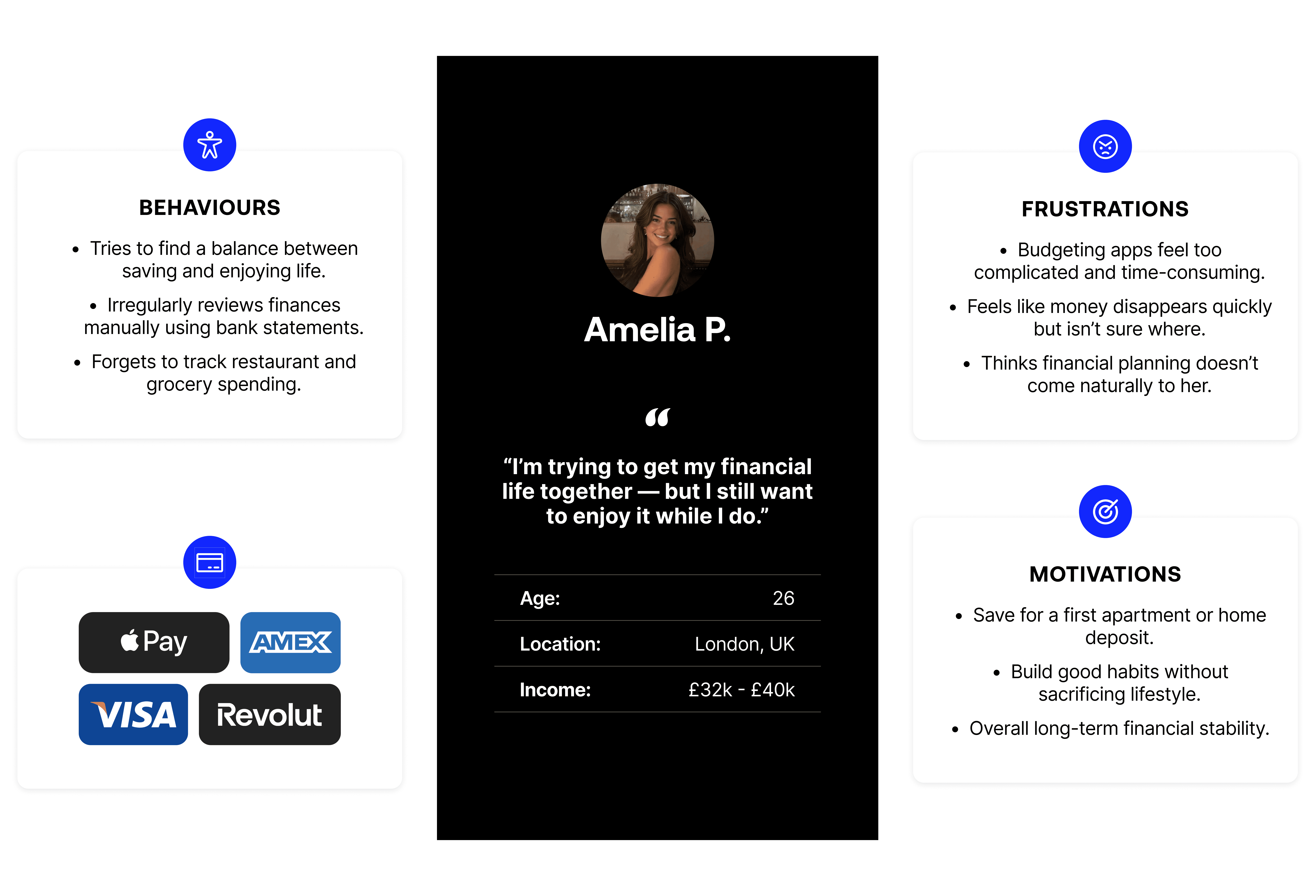
Meet Amelia P.
To bring these challenges to life, we created a persona that represents the struggles and motivations of young users trying to make sense of their spending habits and build better financial routines.
Our Goal
Make financial planning feel light, engaging and personal. By focusing on three key principles:
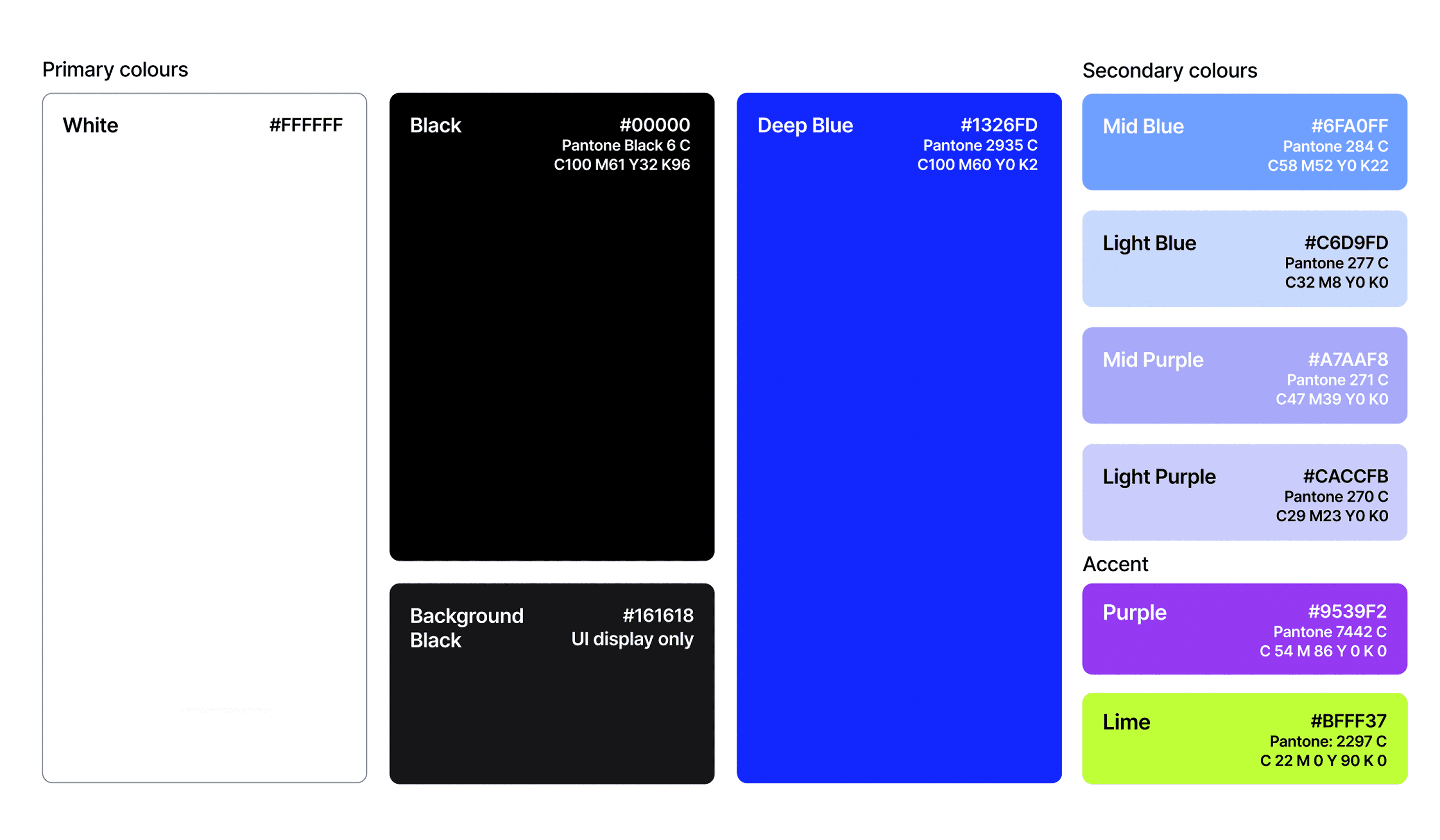
High-Fidelity Screens Aligned with Brand Guidelines
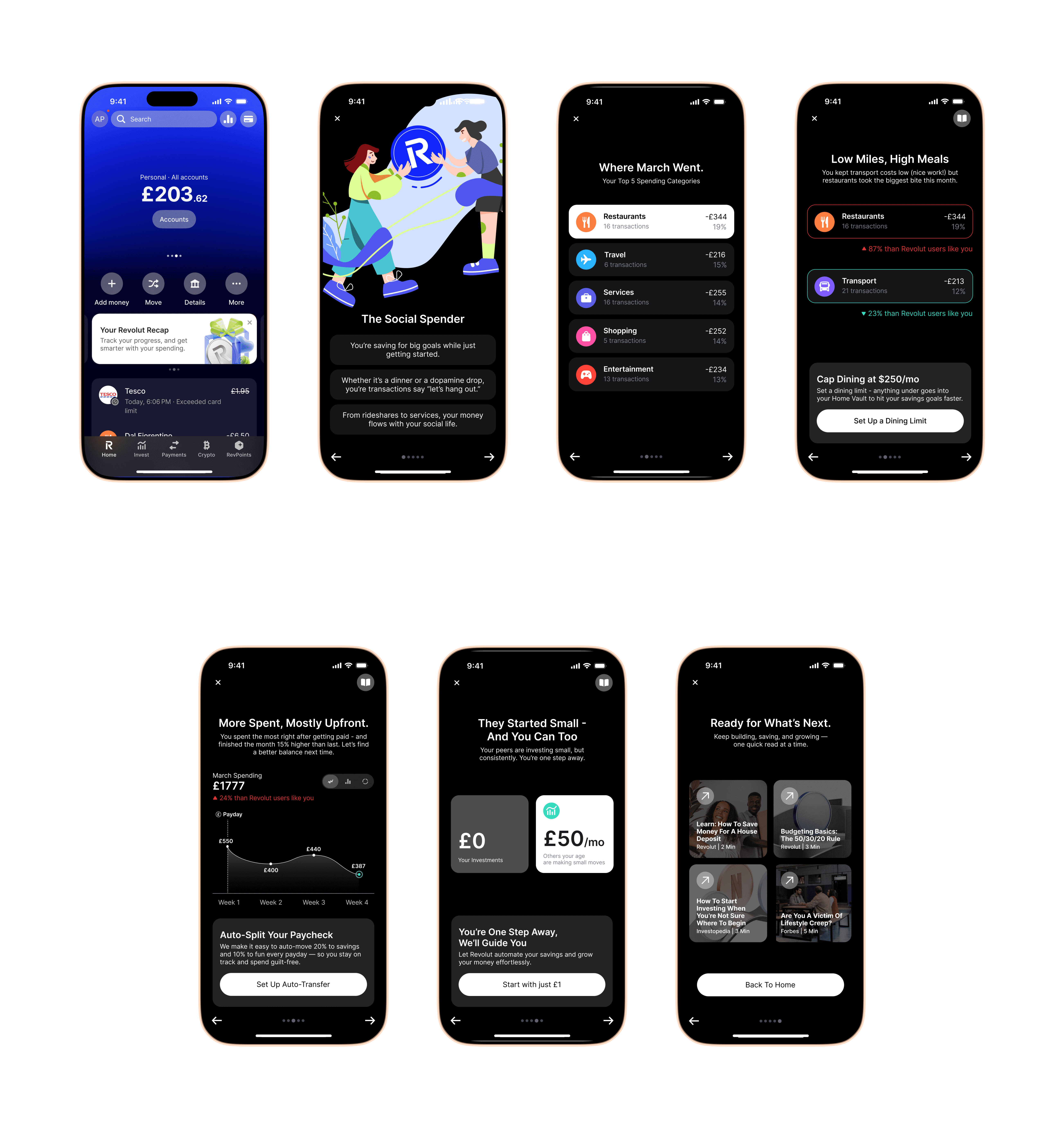
Prototype Walkthrough
The high-fidelity prototype brings the final concept to life with clean visuals, intuitive flows and brand-aligned design. It showcases how users can reflect on their spending in a simple, engaging way.